Monster
Monster - Title Sequence
Working with Norsk Rikskringkasting, Mill+ designed and crafted this beautiful title sequence for Norwegian thriller series ‘Monster’.
Director:
Adam Parry
Production Company:
Mill+
Adam Parry
Production Company:
Mill+
Read MoreRead Less
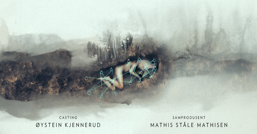
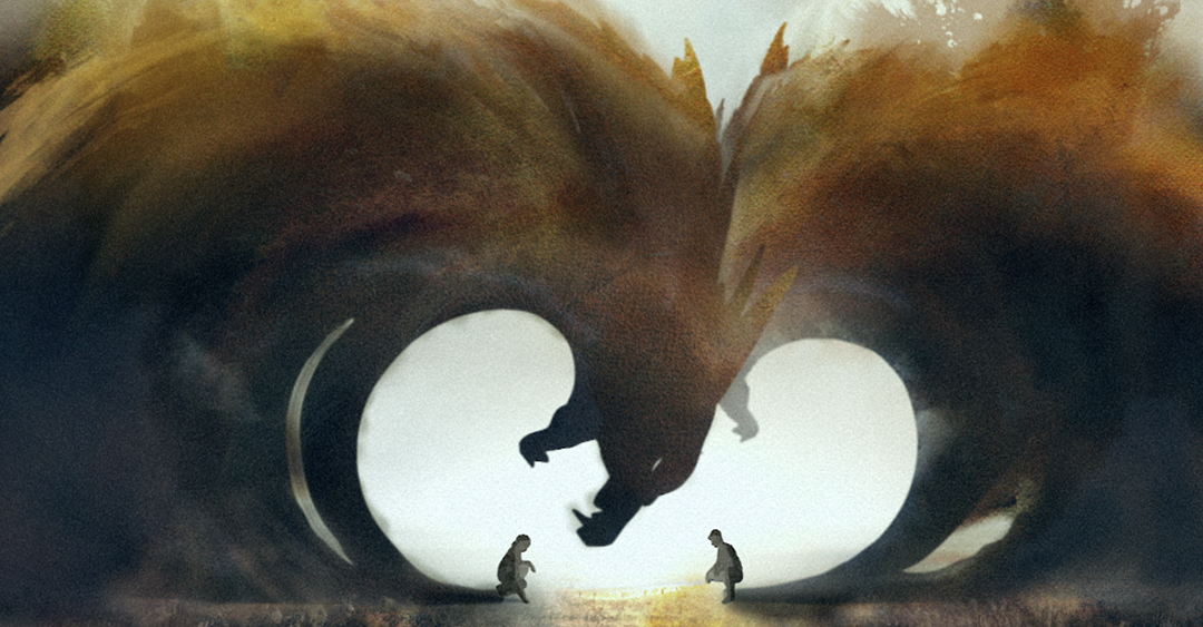
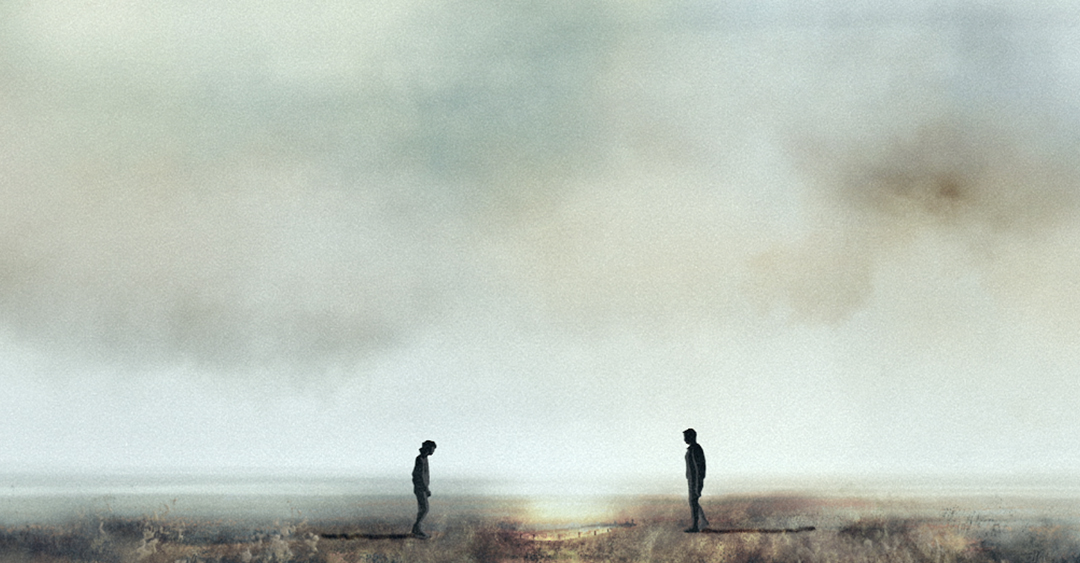
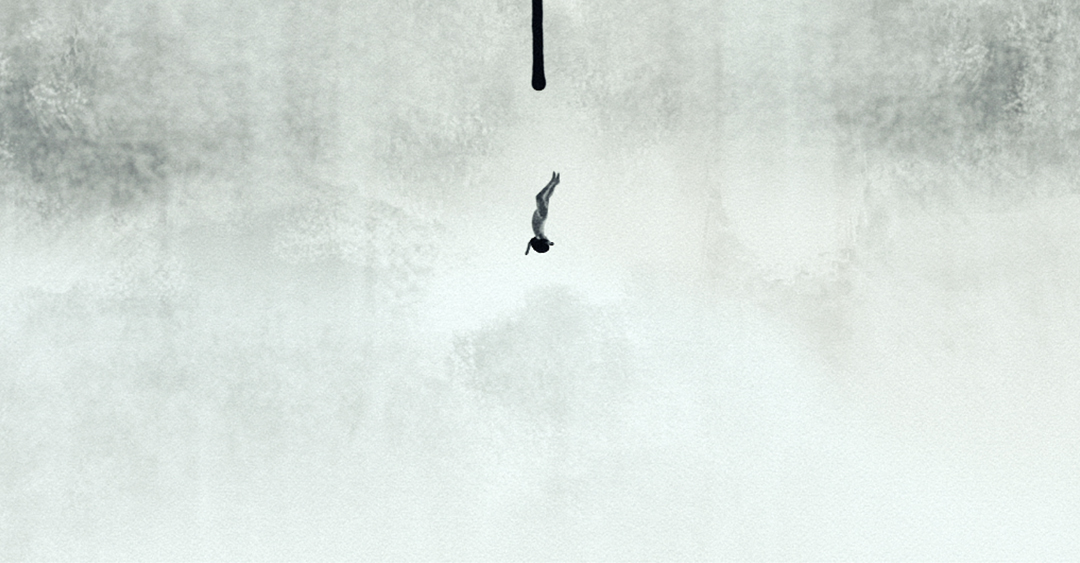
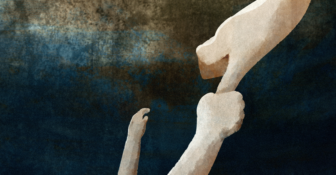
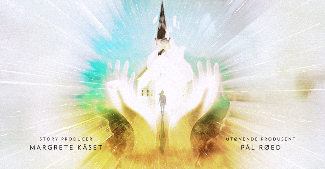
The title sequence for ‘Monster’ visually depicts the narrative of the chilling new series through fluid and ink-like design work which seamlessly seeps from one scene into the next. The piece begins with two people standing over a burial site before seeping into scenes of a figure falling into a puddle like surface.
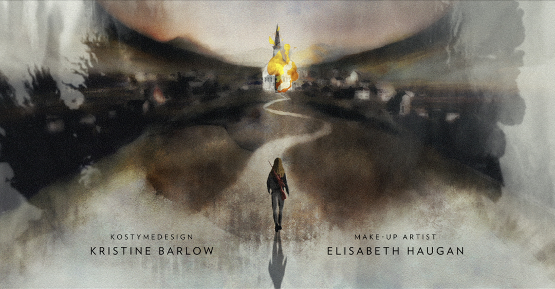
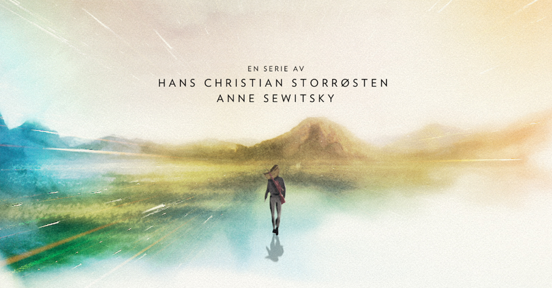
The piece closes with a female figure walking through a blazing building and reappearing the other side on a long stretch of road through the mountainous range of Norway. This spot beautifully highlights the multiple themes which run through this chilling new series.
Mill + Design Director Adam Parry explains, ‘Although dealing with incredibly dark themes the Mill+ team decided to keep the treatment of this sequence visually bright to represent the sense of hope and redemption that were portrayed within their storyline.
Ann Sewitsky, Director and Co-creator of the series, briefed the team on all the themes that run throughout the series, one of the most important being how the remote Norwegian landscape is used as a metaphor for the characters state of mind.
Another strong brief we were given to explore, was the use of watercolours, paint dripping and seeping across the paper. We subsequently decided to give the piece its own unique visual identity, combining a mix of Flash & 2D animation together to create an illustrative language in which all these elements could work seamlessly together.
From storyboarding, direction, illustration and animation, the team worked closely together to craft a sequence that becomes the thematic prologue to the entire series.
This was an incredibly rewarding studio project, allowing us to take the sequence all the way through from conception to final execution’.
CreditsCredits
Mill+ Production
Production: Mill+
Director: Adam Parry
Executive Producer: Alex Finch
Producer: Claire Howse
Director: Adam Parry
Executive Producer: Alex Finch
Producer: Claire Howse
VFX Creative
VFX Creative: The Mill
Creative Director: Adam Parry
Art Director: Grant Berry
2D Artists: Nick Maroussas & Adam Parry
Designer: Hilary Kennedy
Matte Painting: Jiyoung Lee, German Casado, Aurelien Ronceray, Grant Berry, Ross Urien
Flash Animation: Freya Barnsley, Kwok Fung Lam, Matt Partridge, Thea Glad
After Effects Animation: Nick Maroussas, Adam Parry
Colour
Colour: The Mill
Colourist: Oisin O'Driscoll
Colourist: Oisin O'Driscoll
TV Production
TV Production: Norsk Rikskringkasting
Director: Anne Sewitsky
Executive Producer: Lasse Greve Alsos
Producer: Pål Røed
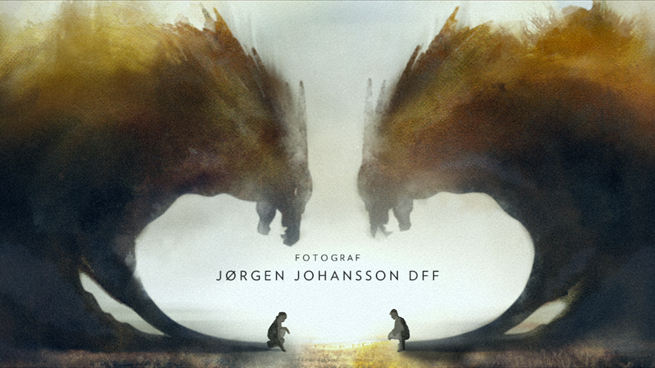
Director of Photography: Jørgen Johansson
Director: Anne Sewitsky
Executive Producer: Lasse Greve Alsos
Producer: Pål Røed
Director of Photography: Jørgen Johansson
Tags
Stills